Friday, 8 April 2011

My double page spread

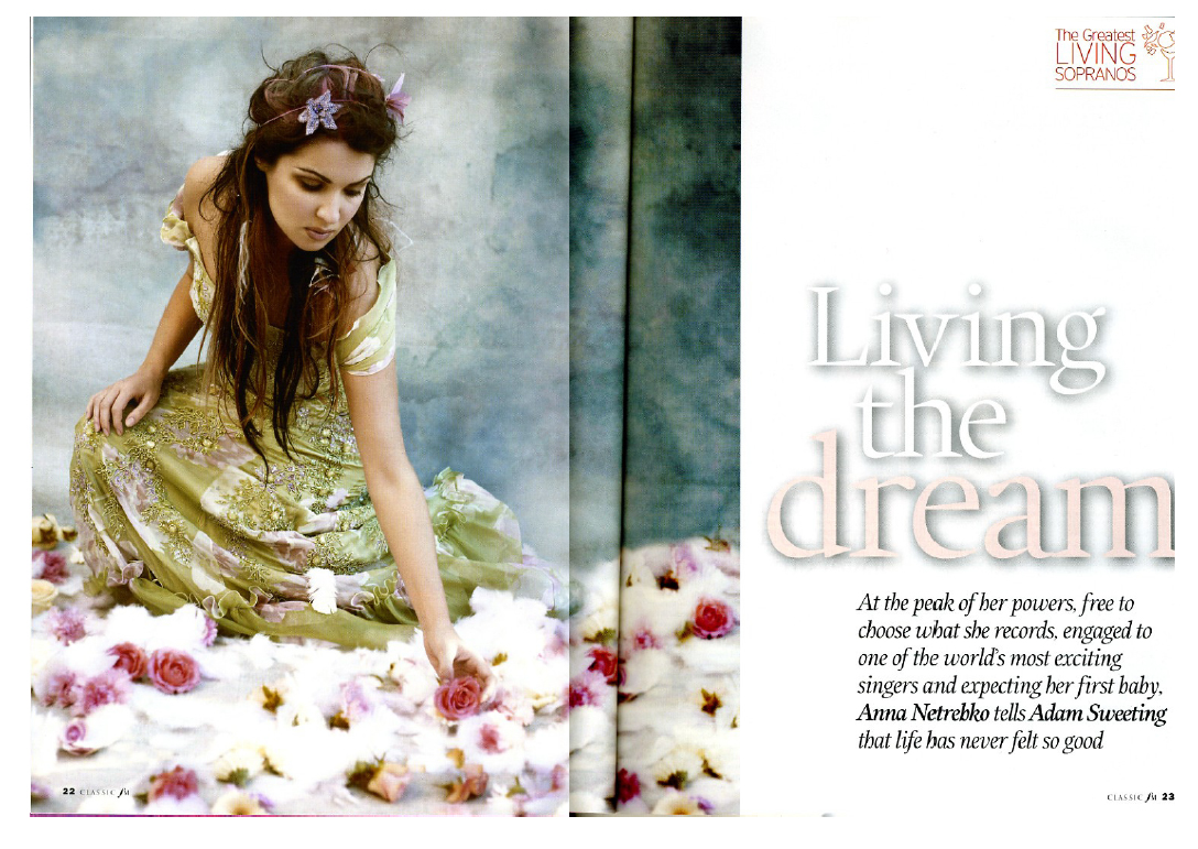
Here is my double page spread:
For this page i have decided to use a photograph were my main celebrity is playing the piano, as i wanted to make the magazine to look more proffessional and have proper instruments included.

Also, like on my previous pages the main colours i used are white and red, but here i have not included any yellow or blue like on the examples as i wanted to keep it simple and similar to the examples i've shown previously.

i have done my page on two A4 pages in Photoshop, and then joined them together to make one bigger double page spread.

I like how it turned out as i think it really suits classcial music because of the colour scheme and its simplicity, also i like how the colours i chose also go well with Christmas, which is partly what my main story is about.

Wednesday, 6 April 2011

Double page spread

As i could not find any double page spreads from classical music magazines, so i decided to base it on
and

as i think both of them would go quite well with classical music as they're both rather simple without any very bright colours, which i dont think go well with classical music.
Also as the picture im using for my double page spread is a full body picture like in the secon one i decided to base it on the second one and have the image on the left and writting on the right.

Friday, 1 April 2011

My contents page

Here is how my content page looks like:
I have kept the same colour scheme that i have on my magazine cover, so white and red with bits in blue and yellow.
Also i have added a 'subscribe' advertisement as on the content pages that i looked at, a lot of them have one.
Plus i personally think that copying other's work, even if its just for a school project is something wrong, and that nobody should have their work copied, i have decided to try and make my own design for the content page. Personally i think that it works quite well as even though it has a rather simple structure with two colums, because of the red headers I have icluded for each story it doesn't look boring or too plain. Also i have decided to have the pictures on the right, as this is where your eye's wonder first, and as most people find pictures more exciting than just writting they'll look at the pictre first, then at the blue number and lastly at the story summary on the left.
As i felt that the two blue nubmers looked quite weird on their own, i have done the writting at the bottom blue as well to keep a balance between the colours and have a similar amount of the yellow and blue against the red and white.

My magazine cover

I have decided to call my magazine 'Harmony' as i think that it works very well with classical music because i feel that Classical music is based on the harmony of the music and instruments together.

I saw that a lot of the magazines i looked at had red, black and white and one of the examples that i showed before had mainly red and white i decided to make my magazine have this colour scheme as well.
here is how my magazine cover looks like:
i have made red white my main colours, and as i have decided to make it a Christmas edition i have added i bit of yellow as well. I think the yellow works well as it matches her hair and the buttons.
I also feel that making the main story title blue is good as well as then you can easily see which is the main story line and as it is connected to her eyes it makes them stand out more.
ive tried making the title red as well but i felt that it looked to fake and it stood out too much, while in most of the magazines i looked at it was the model that cought your attentino first, and not the magazine titile.

I have also decided to make it £3.99 as based on the research i did on other magazines this would be a good affordable prize.

Magazine cover research

I have decided to make my magazine a classical music magazine.
The magazines that I have looked at are
and
What i like about both of them is the simplicity with just a few colours, a simple close up shot of the person with the main story and a few cover  lines.
I also like how the colours work on them, for exapmle how the yellowish main story title is a similar tone to the womans skin, or in the other one how the main story title matches the womans clothes.

I have decided to make my magazine aimed at people of around 25-40 as I think this is the age of most people who are interested in Classical type of music.
I have also decided to make it monthly as most of the classical music magaines I researched are monthly, for example the two i included earlier.

Personally I prefer the first one as it is more colourful, and so it shows Classical music as something that can be fun and exciting, and not only boring as most people think.

Wednesday, 17 November 2010

Preliminary task

Research and Planning

ü How did you think about target audience?
I decided that my target audience will be the parents of the students attending my school ‘The Blair academy’.


As the magazine is mainly for parents I designed it with mainly with toned down colours instead of very bright shocking colours, as I think that this would suit older peoples’ taste more.
I knew I wanted to use black as a base, put I wasn’t sure what colours I should use with it. I have experimented with blues, greens and reds to see how they look on the cover.  The red looked quite good, but I felt that mixing red with black is just too common, but blue and green on their own looked very plain, and made the whole magazine look very boring.

Here is a colour scheme of my cover:

In the end I used blues and greens mixed together and white for the text, but I put a pink stroke around my main title to make it more eye-catching and to clearly show that it’s the most important thing.

Considering my magazine is for adults I also made sure that the language used is mainly formal, without slang, so that everyone can easily understand it. 

As I decided to make my school a language college, I made the main story a trip to Italy. The image I used on the cover is one of Vienna, as I though that this will represent the story very well and if parents will see a nice photo of Italy they might be more persuaded to let their children go on the school trip.

In my Content page I used a very similar colour scheme as in the cover as I wanted the magazine to have the same style throughout. Again I made it pretty simple, as I only added text in the middle. I didn’t want the contents page to look to busy and crowded as I wanted to looks similar to the cover which is quite simple as well.

I also added a little bit of information about the articles under the headers, so that you can easily know what’s included in the magazine so you can decide whether you want to read it or not.

ü Photoshop and InDesign

I found using Adobe Photoshop pretty simple and I used it to make my logo and content page as it’s a good program to draw out your ideas. I didn’t really feel that comfortable with InDesign, as I found it really hard to move some of the elements around as often I got confused on the layers. But I think that it’s a good program for designing layouts.